


Waterfall Chart+
Waterfall Chart+ is a custom symbol for PI Vision that allows you to create dynamic waterfall charts. It visualizes changes in metrics over time, showing starting values, intermediate changes, and final values for quick analysis. Part of the Vision Library+ collection.
Features
- Track Metrics: Visualize changes in metrics like production line effectiveness or inventory levels over time.
- Root Cause Analysis: Identify what impacted metrics and when using clear visuals.
- Customizable Design: Adjust colors, titles, and connectors for tailored visualizations.
Screenshots

Track Equipment Effectiveness
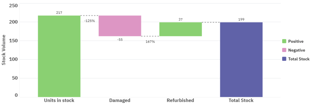
Inventory Over Time
Demo

Questions?
Click the button below to get in contact, or simply email us at contact@software-athlete.com. We would love to help you.