![]()
Combo Chart+
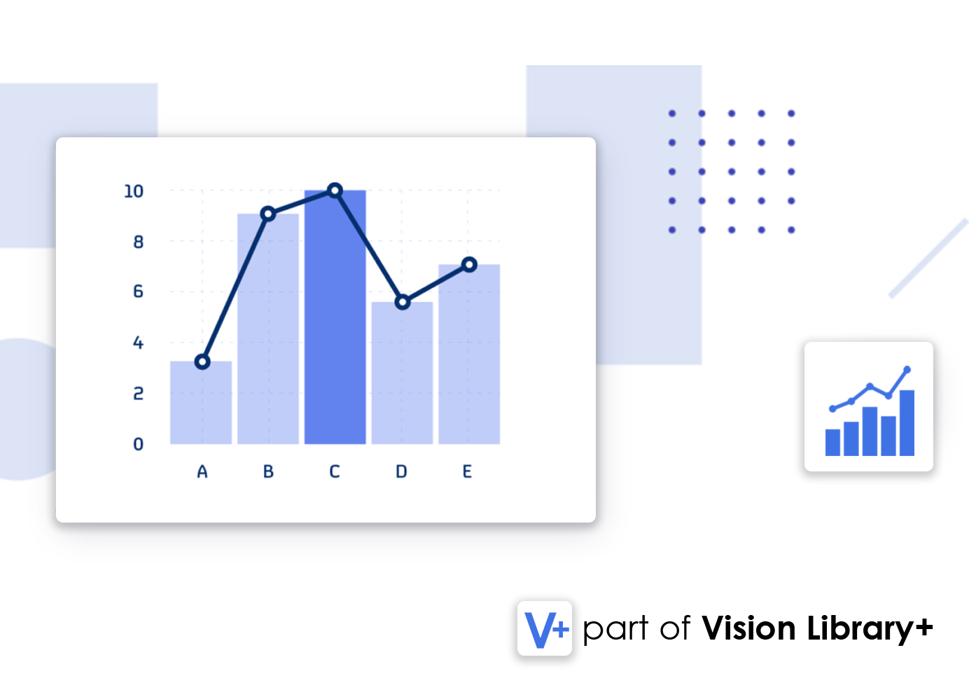
Combo Chart+ is a custom symbol for PI Vision that combines the features of multiple chart types, such as line and bar charts, to deliver comprehensive and intuitive data visualizations. This versatile symbol is part of the Vision Library+ Symbol Package.
Features
- All-In-One Chart: Combine any chart type with PI data to create powerful visualizations.
- Multiple Y-Axes: Customize and configure multiple Y-axes for various data series.
- Multistate Visualization: Use multistate features to highlight key thresholds or limits.
- Customizable Time Range: Easily adjust the time range for targeted analysis.
- Display Event Frames: Overlay event frames directly on the chart for enhanced context.
- Export Data: Export chart data in CSV or JSON formats for external analysis.
Benefits
- Enhanced Decision-Making: Gain actionable insights by combining multiple data series.
- Improved Visualization: Display diverse data types cohesively in one chart.
- Customizable Views: Tailor the chart to suit specific operational requirements.
Example Use Cases
- Production Monitoring: Compare actual vs. projected production values in real-time.
- Resource Allocation: Visualize resource usage trends with combined metrics.
- Quality Assurance: Analyze performance metrics against established benchmarks.
Screenshots

All-In-One Chart
Combine multiple chart types for a holistic view of your data.

Bar Chart
Visualize data series effectively with bar chart overlays.

Area Chart
Highlight trends and cumulative data using area charts.

Multiple Y-Axes
Customize and manage multiple Y-axes for different series.

Multistate Visualization
Use multistate features to indicate key thresholds visually.

Display Event Frames
Overlay and annotate event frames directly on the chart.

Statistics on Selection
Calculate statistics like averages or max values live.

Sparkline Mode
Enable sparkline views for quick and compact visualizations.
Demo
Questions?
Click the button below to get in contact, or simply email us at contact@software-athlete.com. We would love to help you.


